Establishing the Dwolla Ecosystem
Summary (T.L.D.R)
- PROBLEM: The Dwolla ecosystem spanned six separate sites and applications, each with inconsistent design patterns and frameworks. There was no unified guidance to ensure visual or functional consistency across the systems.
- TOOLS: Figma, Material UI design system, Google slides, Storybook
- DISCOVERY: Interviews, presentations, engineer feedback.
- RESULT: The Dwolla systems were unified under Material UI, and a comprehensive design guidebook was developed to support consistent implementation. This resulted in a more accessible platform with standardized visual design, creating a cohesive and polished experience for both current and prospective customers.
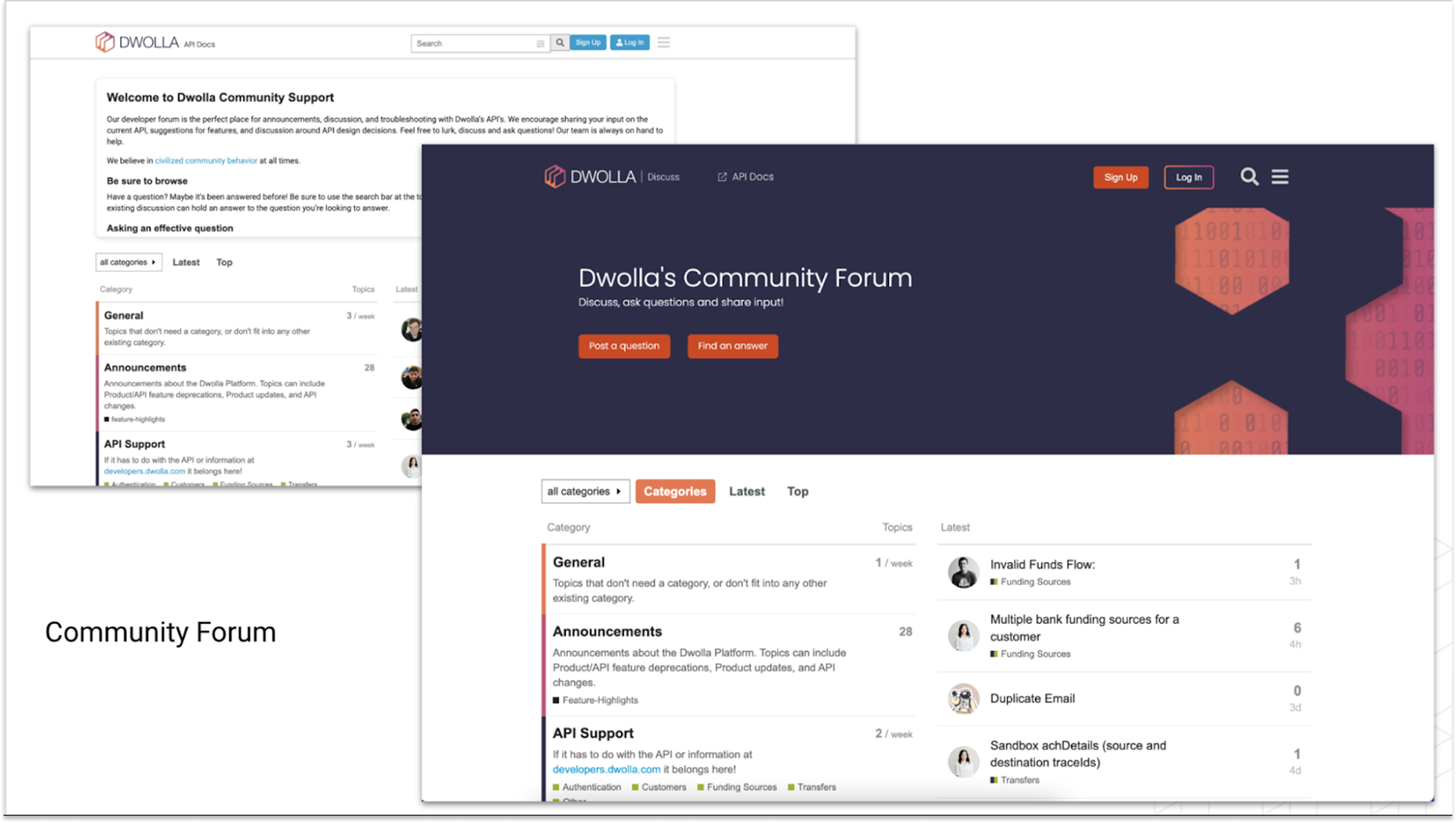
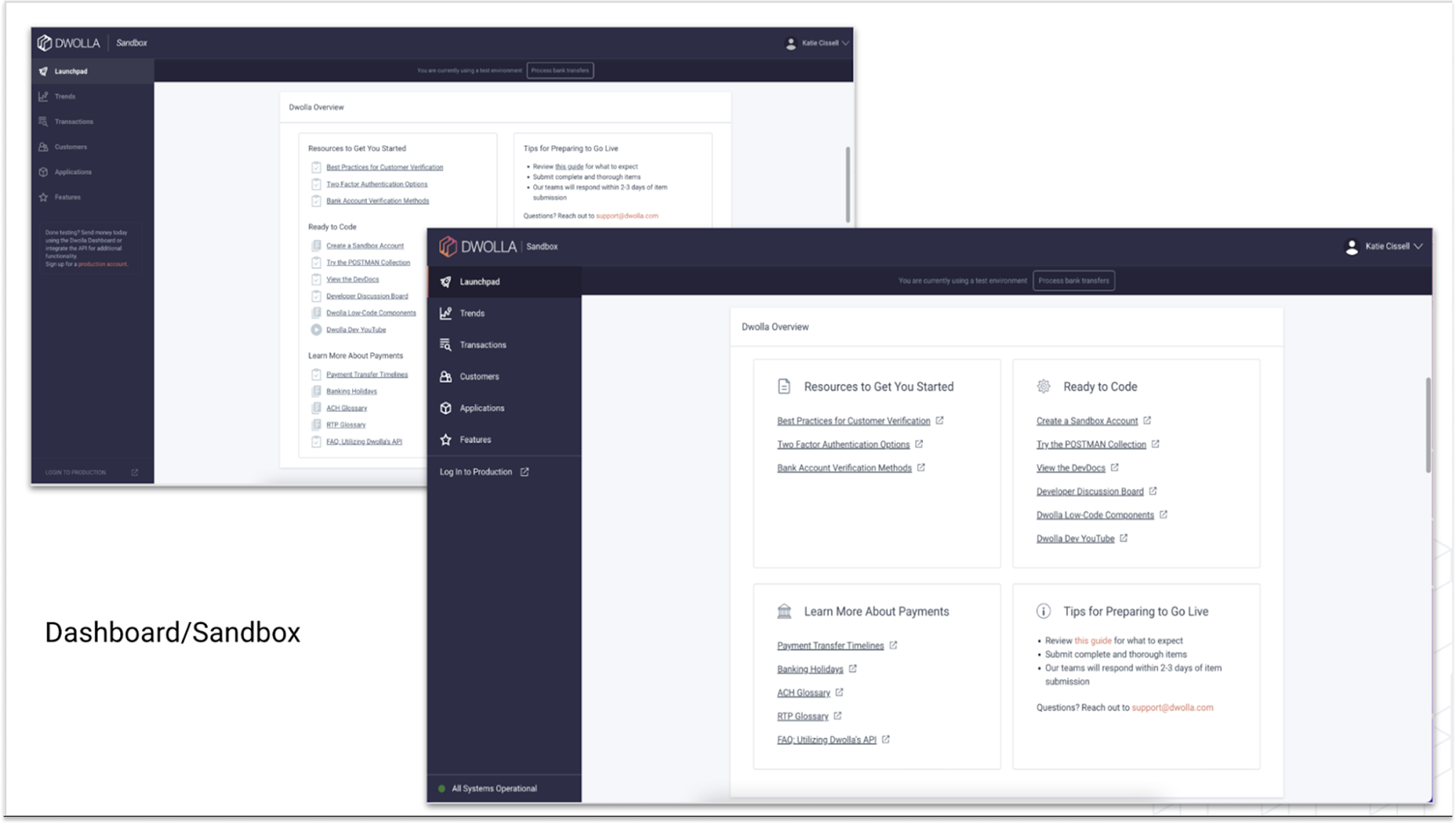
The Dwolla ecosystem is spread across 6 different sites/applications. Each site has different users, different backend frameworks and even different colors of buttons. Not much was consistent across the entire company’s platform and there was very little guidance about how to actually create the sites from design standpoint (patterns, components, tone or visual styling). I pitched the idea of creating a true Dwolla Ecosystem and spearheaded two projects to unify Dwolla under one documented design and design system.
The two projects were a conversion of our design system to Material UI and the creation of an Ecosystem Guidebook to set the ‘rules’ for future updates. (I also spent a lot of time with engineers cleaning up what already existed to match the new rules.)
Conversion to Material UI
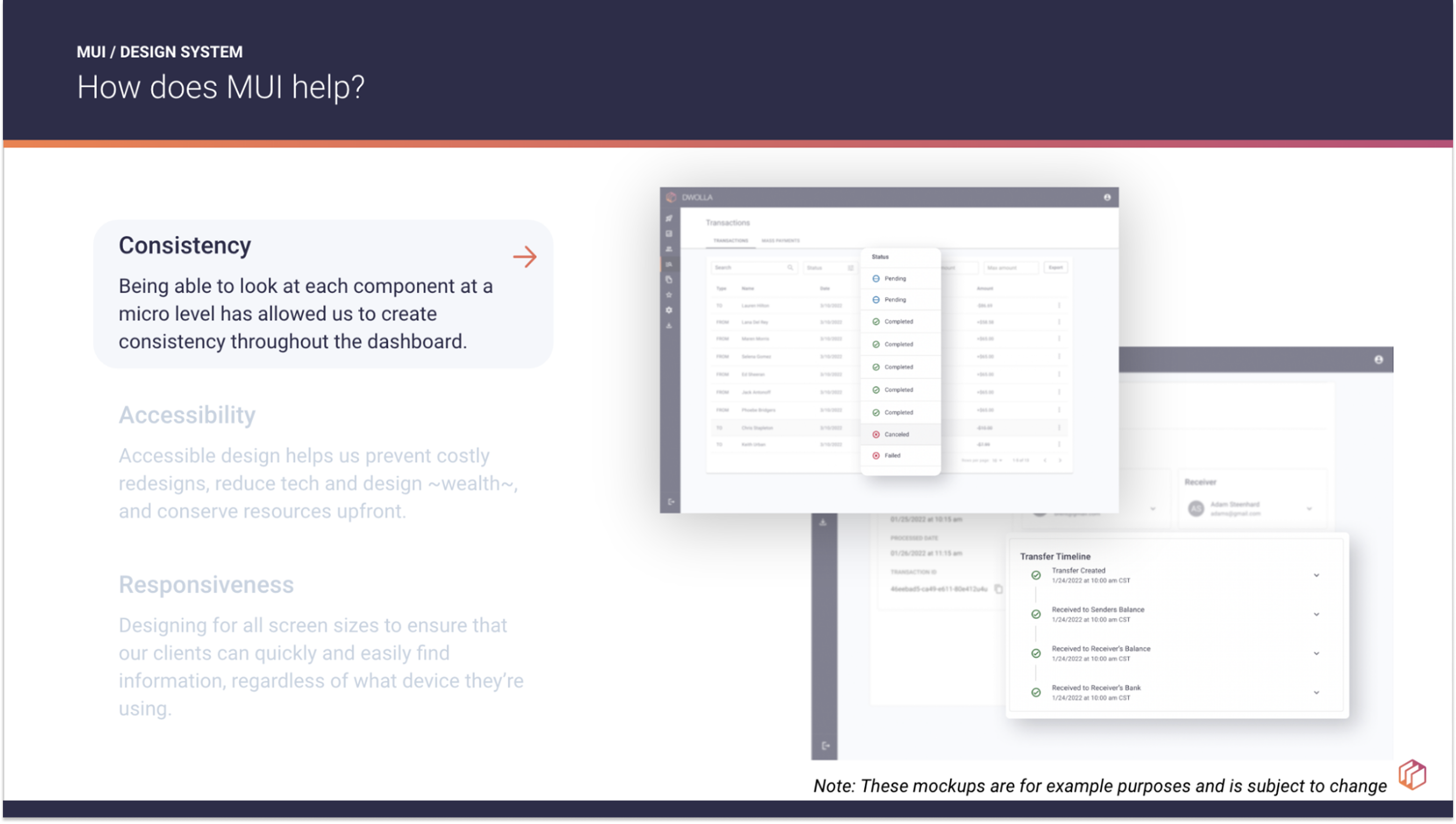
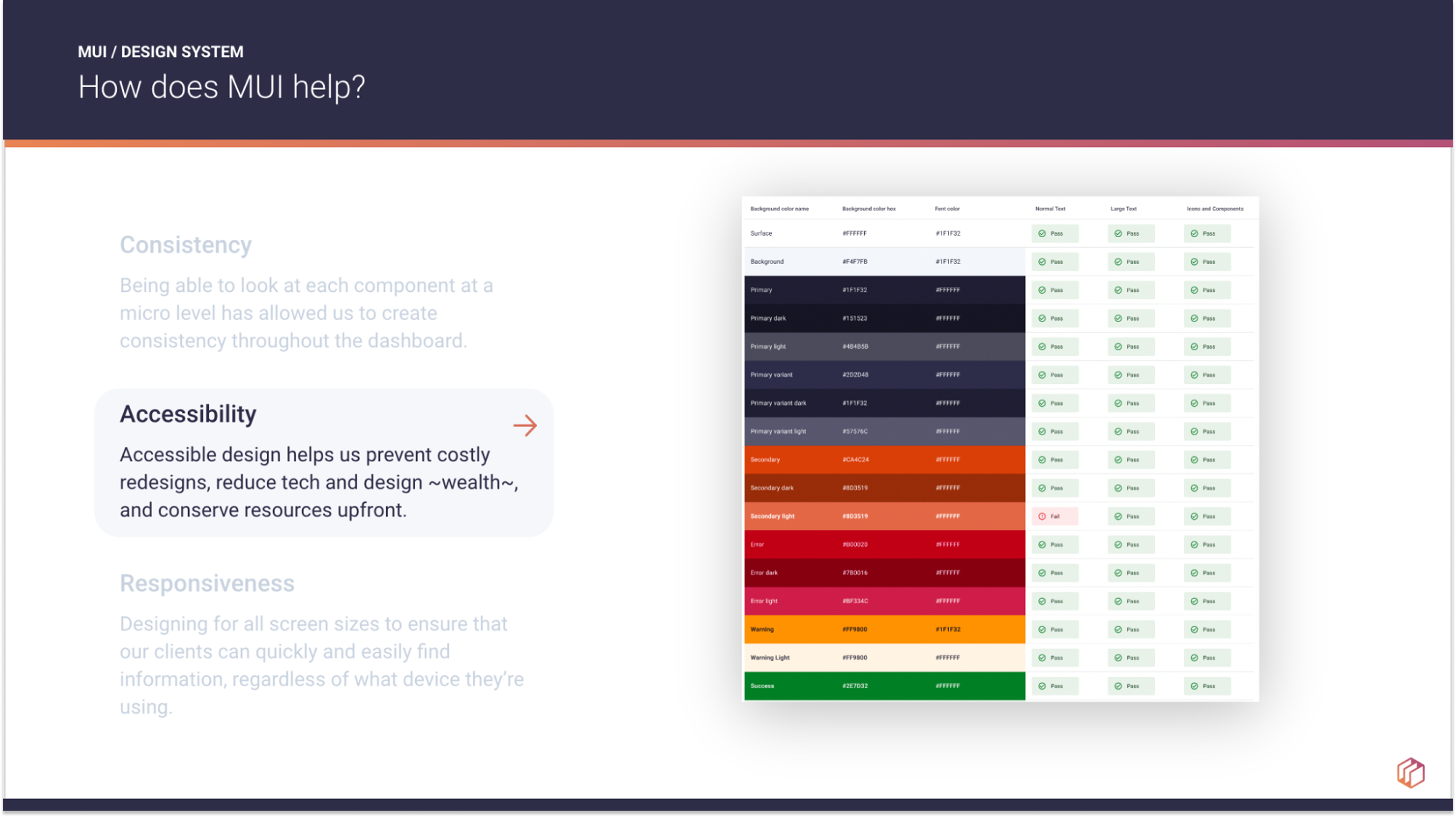
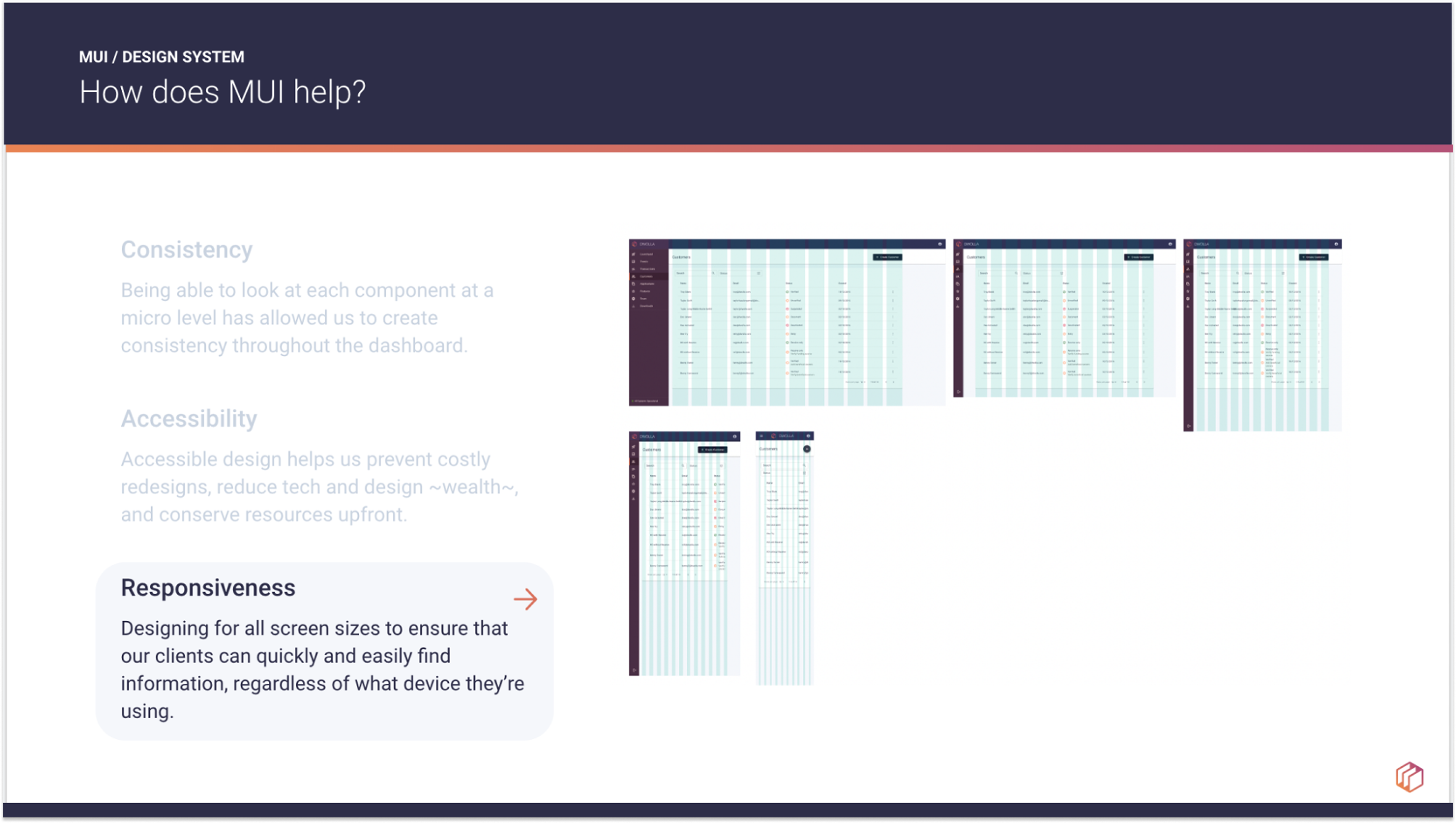
As a part of this full ecosystem relaunch, we converted our web applications to Material UI. I led my UX design team and marketing’s designer to develop a consistent color palette, tone and component library all built upon the fundamentals of Material UI. We chose Material UI after many discussions with engineering about feasibility and capabilities of all the various design systems we explored. Material UI’s emphasis on accessibility plus its ease of use for engineers won our company over.
Conversion challenges:
- Storybook was outdated, full of one off components and unable to be updated by UX designers.
- Our “Design System” was scattered across 3 separate Figma files, had several versions of some components, little documentation, and was in general incomplete.
- Marketing was not a part of the original design system creation, resulting in the web applications managed by R&D being different styles than marketing owned portals.
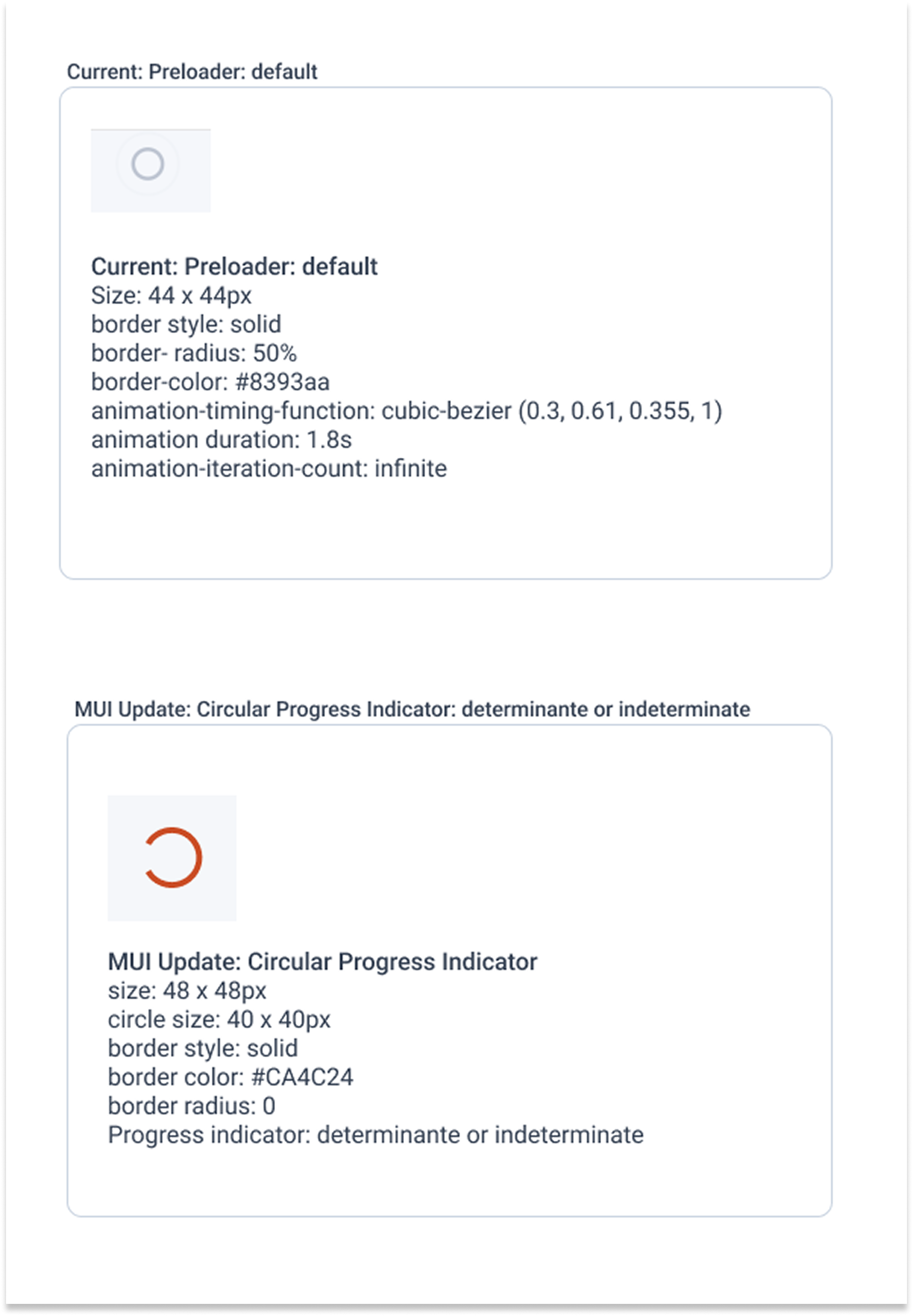
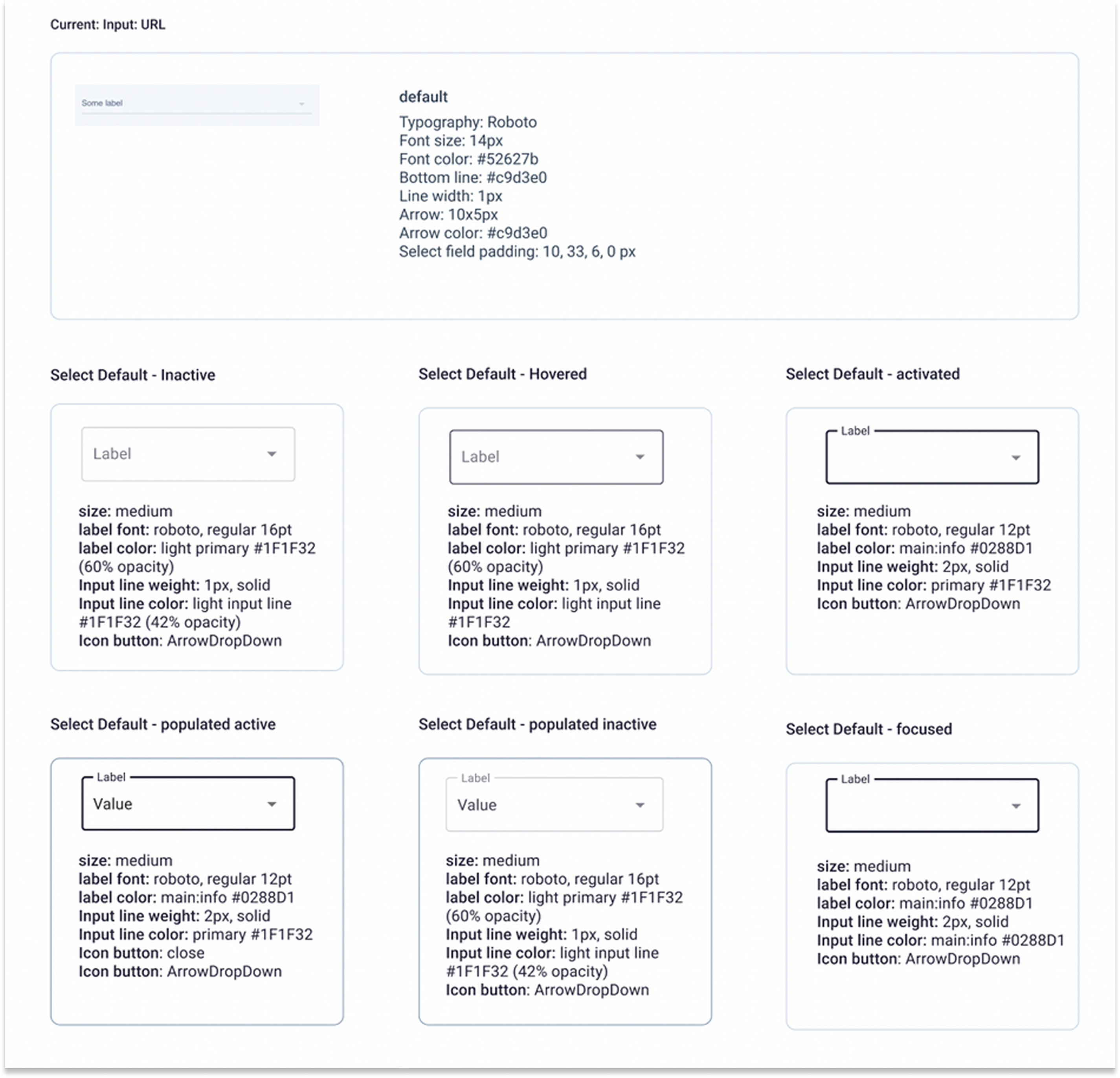
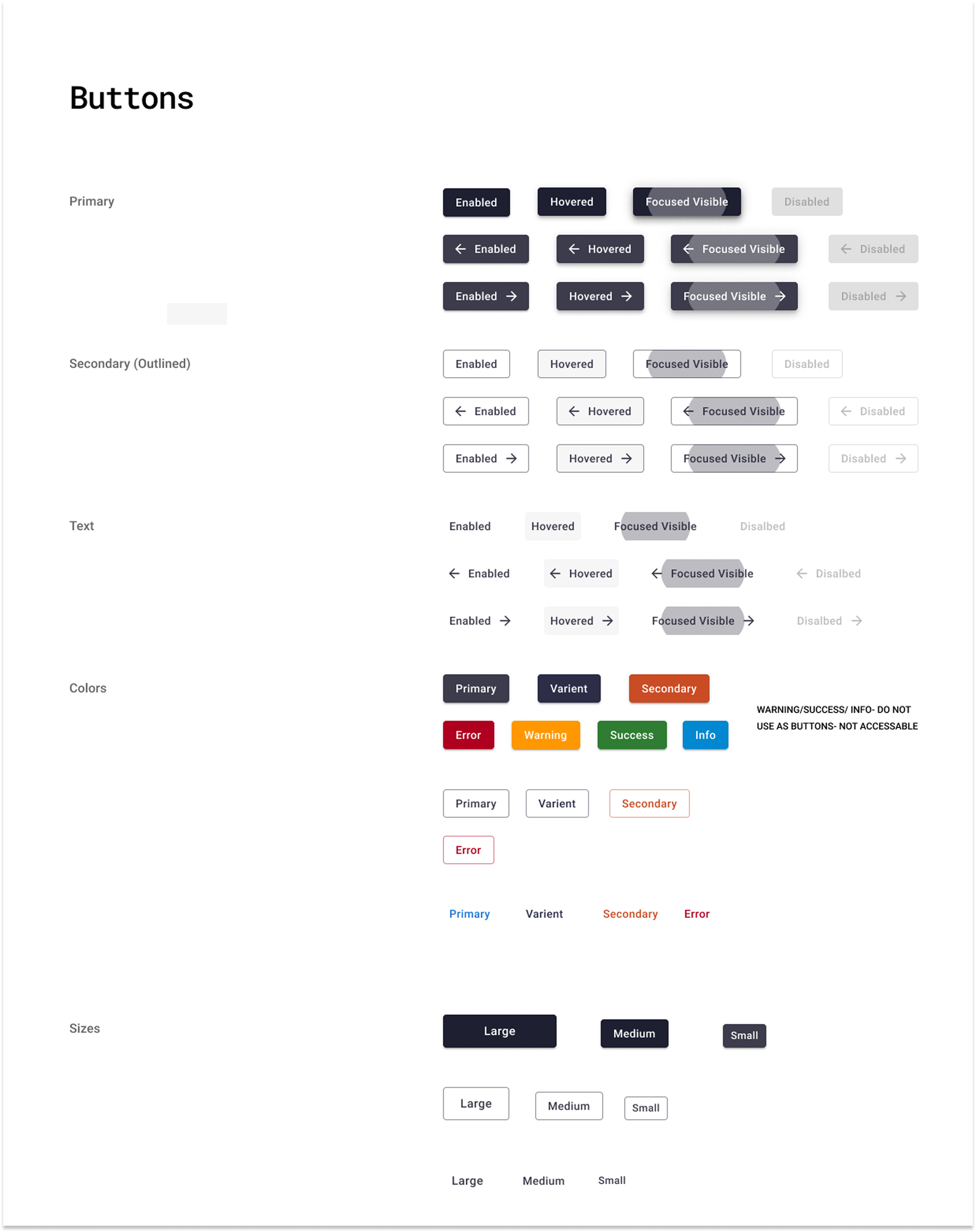
Every single component in our web application was audited and mapped to a MUI component in Figma. As a part of this process every component also had their Font and Color updated. This work was done in Figma, which was then shared with the company for everyone to use but mostly geared towards our engineering teammates who we worked with to divide up the work of implementing each new component. A great deal of tedious work went into the auditing, development updating, and then testing every page to make sure the component looked and worked the exact way we wanted it.
The end result was not only did the web applications look completely refreshed, but we had a beautifully organized Figma design system that allowed the UX design team to call up components quickly, rather than hunting through old design files in the hopes they had a component we needed. Speed and consistency dramatically improved in our mockup and prototype processes. We also could more easily onboard new designers, had documented our process for future designers and had the page with all the audited components should we ever need to refer back to the old components.
Creation of the Dwolla Ecosystem Guidelines
While the conversion of our web applications to Material UI was going on, I was also creating a guidebook (in the form of an easily shareable presentation) on typography, color palettes, page layouts, headers/footer layouts and general component usage. I also was working with the marketing to create a consistent logo style to be used across the platform.
This Ecosystem guidebook provided guidance on:
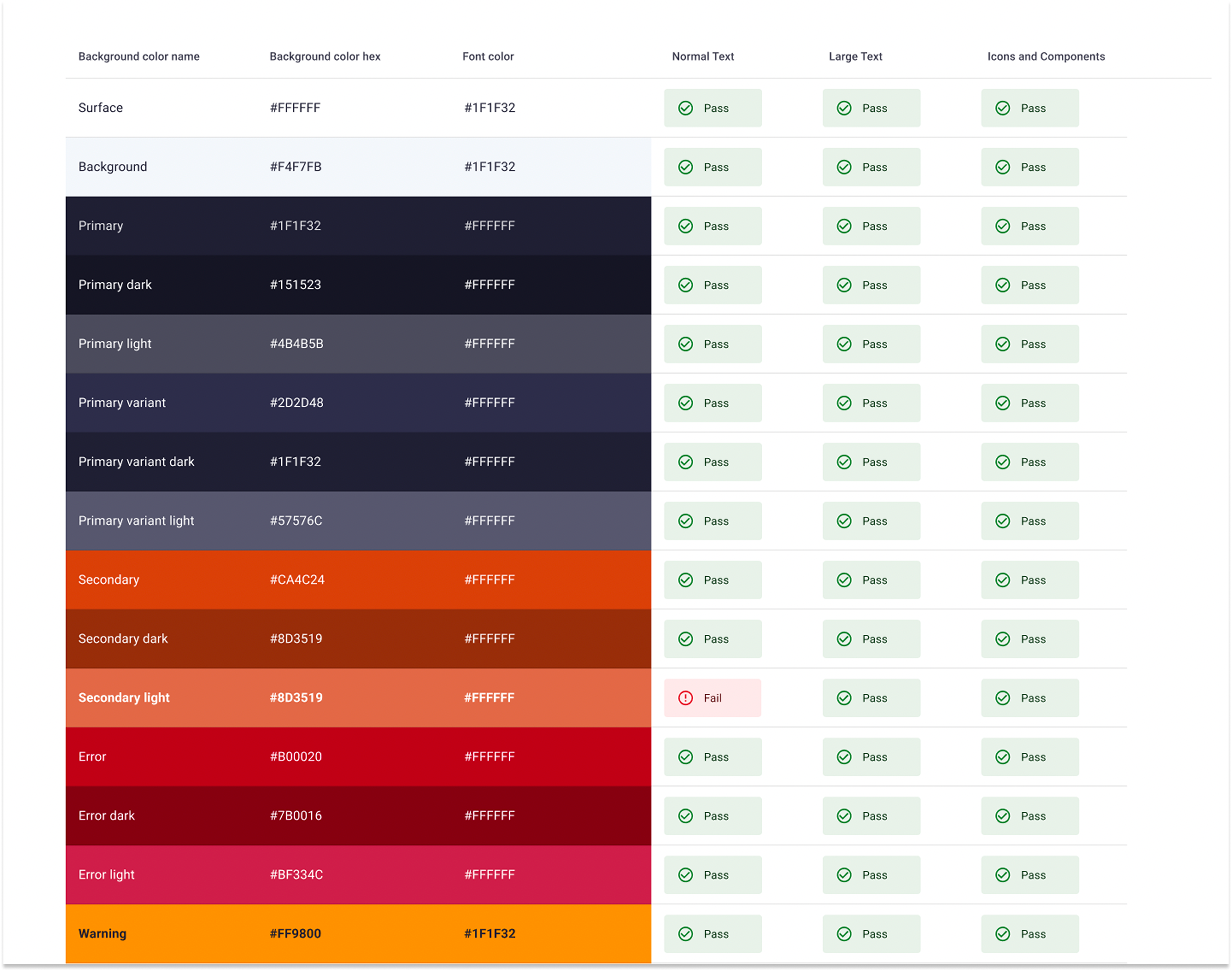
- The Dwolla Color Palette, updated to be more accessible and streamlined
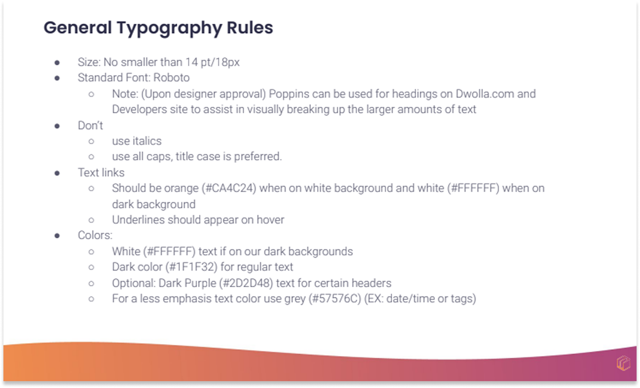
- Typography
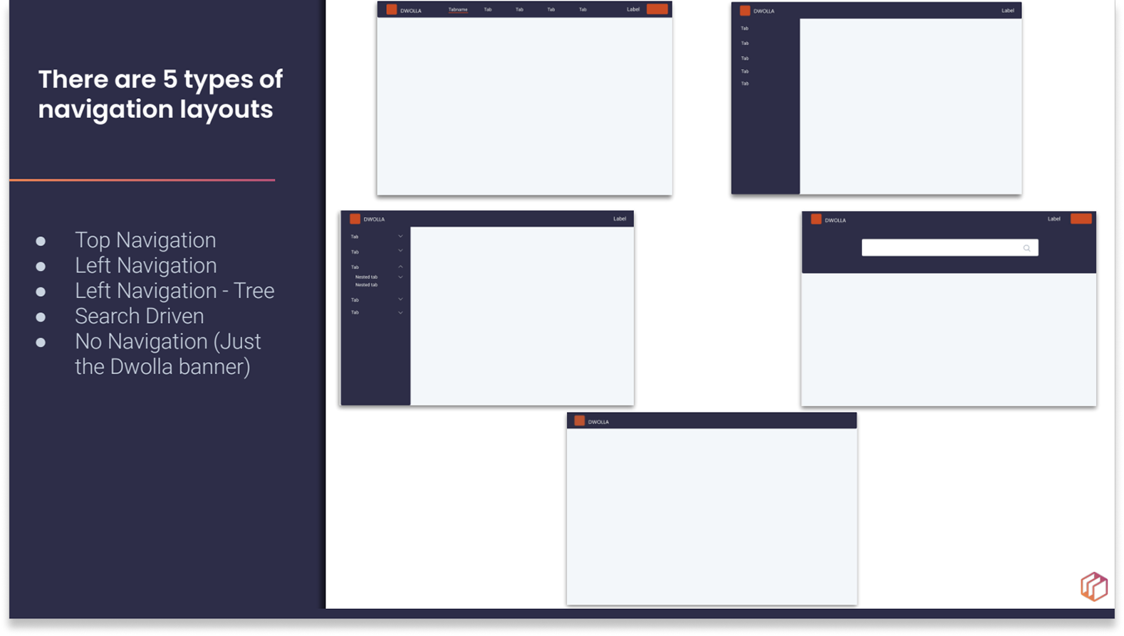
- Navigation Styles
- Page layouts
- Footer and Header layouts
Results
With the creation of the Ecosystem guide book we were able to note many areas that could be more consistent with the other sites in the Dwolla platform. A list of updates needed for each site was created, prioritized and implemented. The end result was a Dwolla platform with increased accessibility, visual standards, and a consistent style presenting a more refined persona to our potential and current customers.